Anonymously
Care about Workplace Ethics? Rate and Review Companies Anonymously
UI/UX Case Study
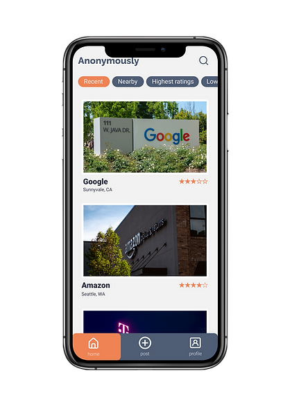
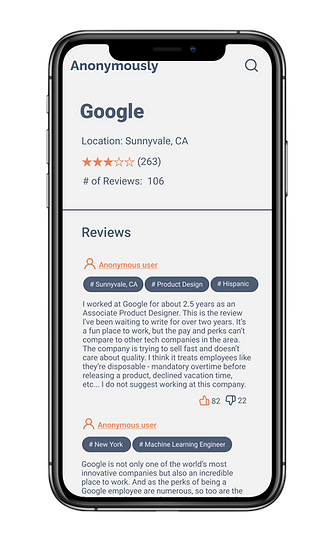
What is Anonymously?
Anonymously is a mobile app where users can anonymously rate and review the companies that they worked for and put them in Anonymously’s database, to help avoid unethical companies and recruiters.
Anonymously will never put the user’s identity at risk. Instead of revealing the user’s true identity, Anonymously only uses hashtags to differentiate user groups.
Why choose Anonymously?
Use Anonymously to anonymously share your experience working at companies. Join the community to rate companies and find one that is right for you.
What are your coworkers hiding? Ex-employee will anonymously tell you what your company is like from the inside. For free, anonymously, and without any risk.
Target Audience
Anonymously is designed for people who are in the workforce and hope to find a safe platform to share insights, or complain/appreciate the company that they are working at or worked for.
How does Anonymously work?
Users will rate the companies they work for and possibly leave a review, anonymously. This will allow users to share information that others might not know, whether or not a company is doing things right, and whether or not we'd recommend it to a friend.
Design Process
I. Discover Phase
Problem Statement
There are issues that exist at the workspace. It is difficult to solve these issues if the victims are unwilling to talk directly to the leaders in the company and it can be risky. There is nowhere for users to look at the actual data of how good/bad a company is treating its employees because a lot of employees rather stay silent.
Users and Audience
The users and audience should be the victims of the issues or the user group that can be exposed to the issues listed at work. The audience group is all genders, all ages, including those who have retired.
Solutions
To build a better and equal workspace and solve the issues, the potentials solutions are establishing an organization to examine and correcting company policies, or to build a platform for the victims or potential victims to inform others.
Research
I did research on different types of inequality issues that can happen at work and noted the major ones, which are: unfair pay, bias, discrimination, bullying, mandatory overtime, gender inequality, no vacation time. Based on the data, I plan to implement these factors into my design.
Pre-Interviews
I interviewed a few friends who are participating in the workforce. One of the main results is that they are not willing to complain on the company that they are working for because their co-worker or company may find out their identity.
II. Design Initial Prototype
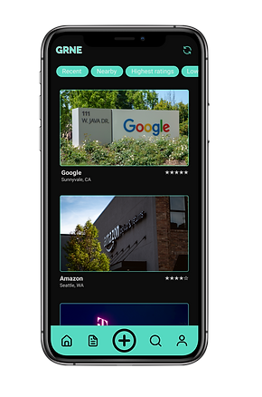

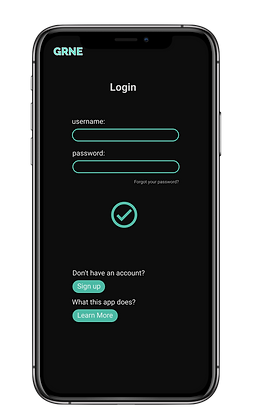



Usability Task Definition
Task 1: Sign up and learn more
Scenario: When the user wants to interact with others in the “community” page on my app, they need to create an account to do so.
Task Steps: The user will first read about what my app does, then they will be able to sign up by entering some information(a short survey) as well as creating an account name and password.
Note: The user can skip “learn more” by tapping on the “sign up” button directly. Users can cancel signing up by tapping on the home or other button at the end as well as the cancel button during the process.
Task 2: Post information
Scenario: Once the user decides to post, there are two options: post ratings and comments on companies or post in the app’s community where users share stories and feed.
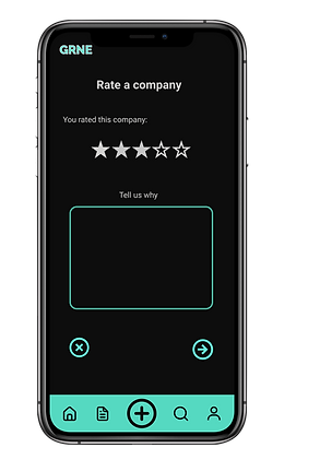
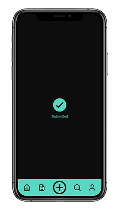
Task Steps: Users click the “+” button at the end, then select which type they are going to post. Once selected “rate a company”, users will need to enter the company info as well as other related information. Then, users can rate the company by clicking the stars (5 stars for best score, zero for the worst score). After, users click the “next” button to add comments. Once complete the comment, users need to submit the ratings. If users want to post in the community, they will need to select that option. Then, users will be able to type stories as well as add any links, emojis, pictures, as well as their location.
Note: For all the steps above, users can go back or cancel the process anytime by clicking on the home button or delete button.
Usability Test Summary
Study Goals
-
I trying to see if users are able to figure out how to post ratings for companies as well as personal stories on the app.
-
I want users to be able to or willing to register for accounts so that we can collect the data and solve more issues in the future.
-
I am trying to learn if users are able to interact with the app easily. I also want to learn how my users react to inequality issues on a platform where they can talk about it freely.
Logistics/Methodologies
-
Zoom video conference
-
In-person (real-time)
-
Over video conference, with one observer at a time remotely.
-
In-person user interview, the user will do the test directly and right next to me without interacting with me.
Participant Profiles
-
Young, observer 1, under 25 years old
-
Young is a female who moved to the United States when she was 10 years old.
-
-
Sierra, observer 2, under 25 years old
-
Sierra is a female who is about to graduate from UC Davis.
-
-
Daniel, observer, 25 years old and above
-
Daniel is a male and had more than 5 years of work experience.
-
Task Names
-
Learn more about the app then sign up
-
Rate a company
-
Post a story
Goal of Task
-
Learn about the efficiency of “sign up” questions
-
Learn about the efficiency of “learn more” content
-
Learn about the efficiency of UI in the “Rate a company” flow
-
Learn about the efficiency of UI in the “Post a story” flow
Metrics of Success
-
Complete the learn more and sign up process with no errors
-
Successfully submit a rating for a company
-
Successfully submit a story
Breakdown of Findings
[Observor 1]
-
The user skipped the “learn more” tasks.
-
Rate a company (found but not smoothly)
-
After posting, where will it show up?
-
Worry: posting stories for the company, will it be anonymous?
-
Good idea: since companies are being rated, they will be able to fix their policy and resolve inequality issues that they have.
[Observor 2]
-
First task: Learn more (Did not find it)
-
Rate a company was not smooth
-
“Stock images of people together will be to more depth to the concept”
-
Frontpage: interesting to see post happening such as “Post near you”
-
A log out button
[Observor 3]
-
Skipped the “learn more” task but returned later.
-
The observer claimed that he would not want to post a personal story on community
-
Hope to see more information on companies from the home page.
-
“Maybe get rid of sign up button since if user click “learn more” and it can lead to the sign-up process.”
Usability Report
Bugs/Weaknesses
-
Repeated buttons - user ignored the “learn more” button and tap directly on the “sign up” button
-
Can’t read some of the white text over green button
-
Dark color app is for money apps such as Robinhood or music apps such as Spotify
-
App does not tell if user’s post will be anonymously
-
Post review section generates too little information
-
After overlay showed up, the button stopped working
-
Need to narrow down what the app does and modify the content
Strengths
-
Navigation is clear and direct
-
The goal of the app has good purpose
-
The learn more flow before signing up gives user a good idea what this app does
-
The star icon rating system is obvious and easy to understand
-
Border design looks great with the style
-
Arrows on each page/flow are effective and save users time to find where to go next.
-
Some users like the color theme
-
Professional and easy to understand images, icons, and buttons.
III. Final Prototype (Link)

Design Decisions
I. Typography
Font: Roboto
- Professional sans-serif typeface
- Minimalistic
- Easy to organize
- Match the color theme
Font Size:
- Content - 16
- Review - 14
- Headlines - 20
- Titles - 24
- Company name (review page) - 36
II. Colors
Background: #F2F2F2
- The off-white background makes the text easy to read and does not cause discomfort to the user’s eyes.
Major graphics & Content: #4F5D75
- Dark navy blue color shows professionalism of the App
- Create great contrast with the off-white background
Accent Color: #EF8354
- Used on highlights, Reminders, and appear when the user interacts with the app.
III. Layout + Design Pattern
- Rounded corners: user can easily differentiate the tasks
- Ellipse design on icon and graphic as highlights.
- Establish space to separate content and spread out information.
IV. Components
Reminder
- Create rounded corners to match the overall design.
Icons
- I chose to use round checkmarks, arrows, and icons that have borders to keep the style consistent so that users will not feel lost and take less time when doing tasks.
User Flow #1 SignUp

User Flow #2 Login

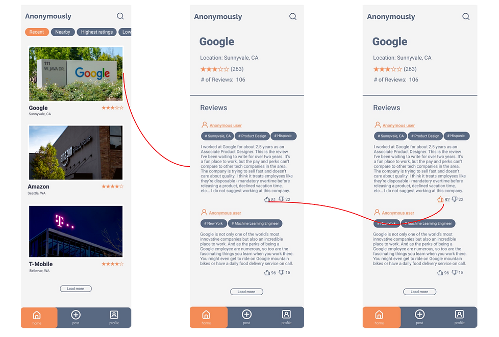
User Flow #3 Post Ratings and Reviews

User Flow #4 Interact with Reviews
IV. Summary of Learning
The “sign up” task was optimized through multiple testing processes, visual design reconstructing, and content recomposing from the previous design.
The “post a rating and a review for a company” task was optimized through multiple user testing processes, user analysis, and the application of a series of usability principles to maximize user experience.
V. Things to be improved
-
After finishing the current stage of the prototyping, new testing is needed to prove the effectiveness of new changes made.
-
To finish building the mobile app, more details are needed for the user profile page as well as the company review informational page.
-
In order to compete with other competing apps, a community section is needed for the app so that users can leave comments and talk directly to others.
-
Another function that could be added is that users not only can register for a personal account but also register for companies. Doing this will allow the company to gain knowledge by accessing insights from its employees so that the company can make improvements and show cares to its employees.
